Colour Theory for Florists: The Four Schemes That Sell, and Why Green Isn't a Colour
Working colour theory for floristry — monochrome, analogous, complementary and the accent scheme, tonal value over hue, why foliage reads as neutral, and testing at retail distance.
Ask ten florists what makes a bouquet expensive-looking and nine will answer with flower names. The tenth — usually the one whose work you screenshot — will say colour discipline. Colour is the cheapest ingredient in floristry: it costs nothing extra and changes everything. Here is the working theory, stripped to what actually gets used at the bench.
The four schemes that do commercial work
Monochrome — one hue in several tones: blush-to-burgundy, cream through butter. The easiest luxury there is, because it cannot clash; the risk is flatness, solved by pushing the tonal range wider than feels safe. (The mono-bouquet is this scheme at its logical extreme.)
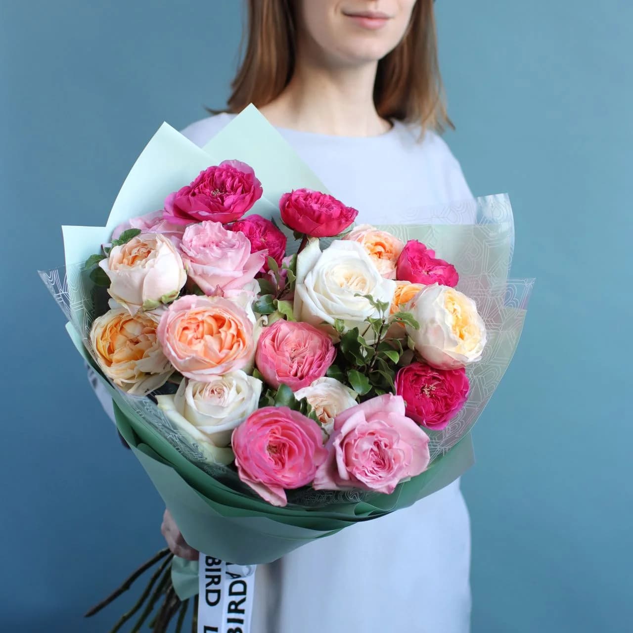
Analogous — neighbours on the wheel: peach-coral-pink, lavender-mauve-blue. The bestseller engine of every studio; harmonious by construction, interesting through texture.
Complementary — opposites: violet with yellow, blue with orange, red with green. Maximum energy, and the scheme that punishes equality: it works at roughly 80/20, one colour hosting the other. Fifty-fifty complementary is a fruit stall.
Neutral plus accent — cream, white and green as the body, one saturated voice as the point: five stems of terracotta in a field of cream. The most contemporary register of the four, and the one that photographs best.
The law under all four is hierarchy: dominant, secondary, accent, roughly 60/30/10. Beginner bouquets fail not by choosing wrong colours but by choosing equal ones.

Value beats hue: the squint test
The concept that separates trained eyes: tonal value — how light or dark a colour is, independent of what colour it is. A bouquet of medium-pink, medium-lilac and medium-peach is three hues at one value, and it collapses into mush at any distance. The fix costs nothing: add darker and lighter versions of what's already there.
The bench test is the squint: half-close your eyes at the finished work. If it separates into lights and darks, it will read across a room; if it fuses into a grey cloud, no exotic flower will save it. Every strong studio recipe survives the squint.
Related and equally cheap: judge at three metres. Bouquets are composed at arm's length and sold at retail distance. The recipe that charms up close and vanishes across the shop is a recipe failure — walk backwards before you call anything finished.
Green is a neutral (until it isn't)
The most freeing rule in floral colour: standard foliage doesn't count. Green reads the way black reads in clothing — structural, expected, invisible to the scheme. You can wrap any palette in ordinary greenery without consulting the wheel.
It stops being neutral exactly when it becomes noticeable: lime viburnum (which behaves as yellow), blue-grey eucalyptus (which cools every neighbour), near-black ninebark (which is your darkest value and should be placed like one). The practical habit: ask of each foliage, "would a customer name this colour?" If yes, budget it into the scheme.
Colour is also the fastest lever for seasonal relevance — the same recipe shifted one step warm reads autumn, one step cool reads spring — and the core of what we drill in the academy's design curriculum, where students spend a full module building palettes before they're allowed to spend money on flowers. The order matters: palette first is design; flowers first is shopping.