Wedding Color Palettes — modern combinations
The modern wedding palette guide — six palettes we build most often at Lacy Bird, with flower selections and photography considerations for each.
Wedding palette is the second decision after venue. Everything else — bouquets, centerpieces, bridesmaid attire, invitations, cake, linens — downstream of it. Get the palette right and the wedding coheres. Get it wrong and every visual element clashes with every other.
This is the palette guide we walk through with wedding clients in our studio.
The six palettes we build most
Not the only palettes possible, but the six that read most-clearly in photography and that pair reliably with modern venue lighting.
1 · Neutral cream and blush
Cream, ivory, dusty peach, pale blush, sage. The default modern romantic palette. Photographs beautifully in every light. Works with any dress, any venue.
Flowers: garden roses (cream, blush), peonies (Sarah Bernhardt, Duchesse de Nemours), ranunculus (cloud, blush), lisianthus (ivory, peach), sweet peas (in season).
Foliage: silver dollar eucalyptus, ruscus, olive.
When to choose: Traditional-to-modern brides who want a palette that never dates.
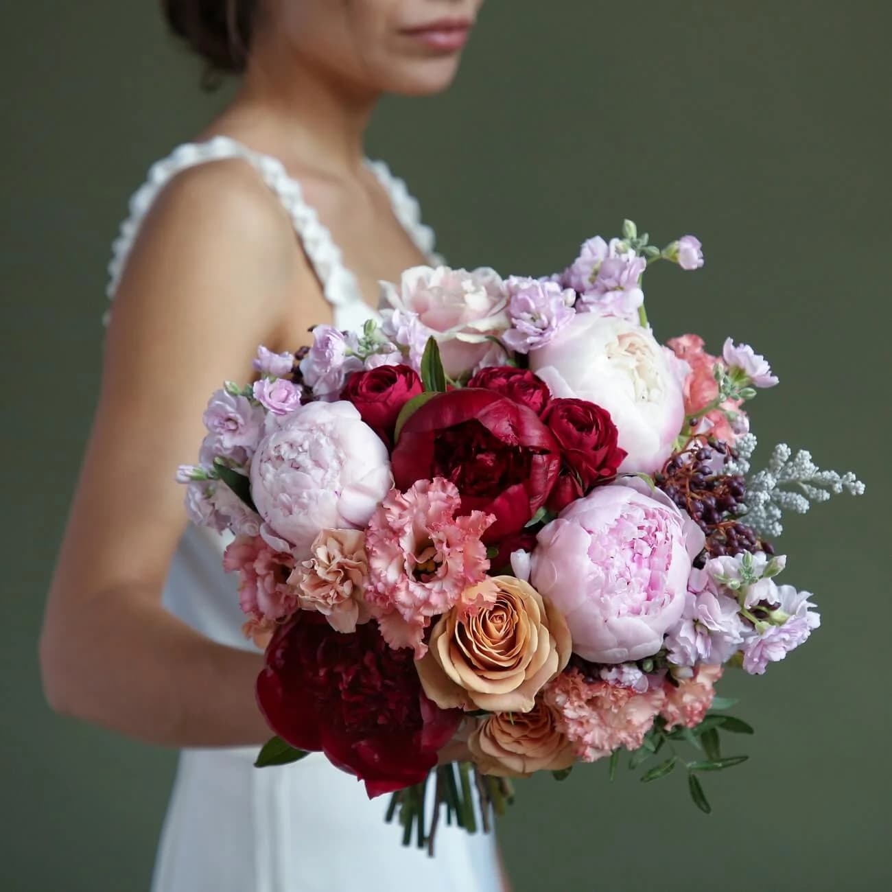
2 · Blush and burgundy
Dusty pink, deep burgundy, cream, chocolate accents. The autumn-winter default. Reads romantic-moody.
Flowers: Juliet garden roses, chocolate cosmos, dahlias (in season), hellebore, plum-toned scabiosa.
Foliage: deep-green ferns, chocolate-brown ninebark, black pepperberry.
When to choose: Fall and winter weddings, moody venues, evening receptions.
3 · White and green
Pure white, cream, sage, deep green. Restrained, formal, ballroom-ready. Photographs cleanly under any lighting.
Flowers: Playa Blanca white roses, Coral Charm peonies (soft cream tone), white lisianthus, white ranunculus, white anemone with black centres for accent.
Foliage: silver dollar eucalyptus, olive, myrtle, English ivy.
When to choose: Ballrooms, formal ceremonies, minimalist and modern aesthetics.
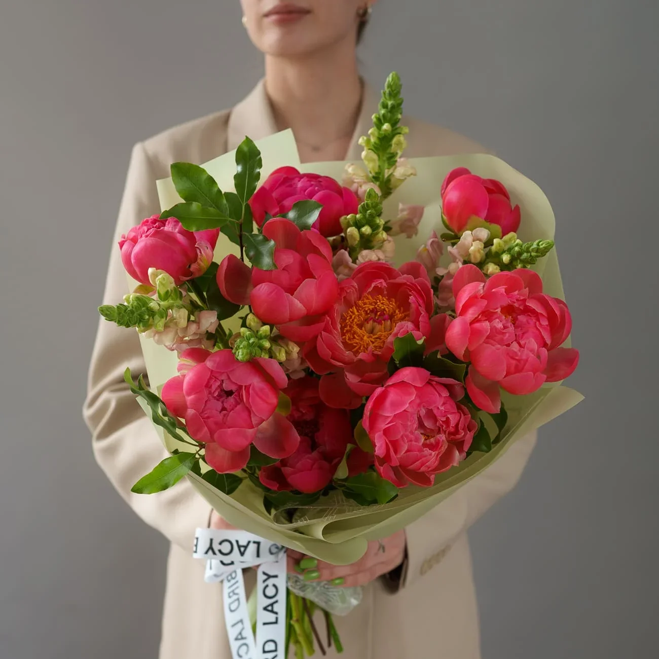
4 · Coral and mustard
Coral pink, warm mustard yellow, terracotta accents, olive foliage. Bright, cheerful, modern.
Flowers: Coral Charm peonies, ranunculus (butterfly coral), marigold, craspedia, protea.
Foliage: olive, dusty miller, seeded eucalyptus.
When to choose: Summer weddings, garden and outdoor venues, brides who explicitly don't want the neutral-blush default.
5 · Dusty blue and pale sage
Dusty blue, pale sage, ivory, warm gold accents. Modern-editorial. Growing trend for 2026 weddings.
Flowers: delphinium (dusty blue), thistle, white and pale-blue hydrangea, ivory garden roses.
Foliage: silver dollar eucalyptus (naturally cool-toned), dusty miller.
When to choose: Modern industrial venues, editorial aesthetic, minimalist and Scandinavian-influenced weddings.
6 · Full moody
Deep burgundy, plum, black-purple, oxblood, chocolate. Dramatic and statement.
Flowers: Black Baccara roses, dahlia Cornel, black hellebore, scabiosa (deep plum), chocolate cosmos, plum-toned lisianthus.
Foliage: black-ninebark, deep-green ferns, aged eucalyptus, red-oak foliage.
When to choose: Fashion-forward brides, evening ceremonies, gothic or maximalist venues, non-traditional aesthetics.
What we don't recommend anymore
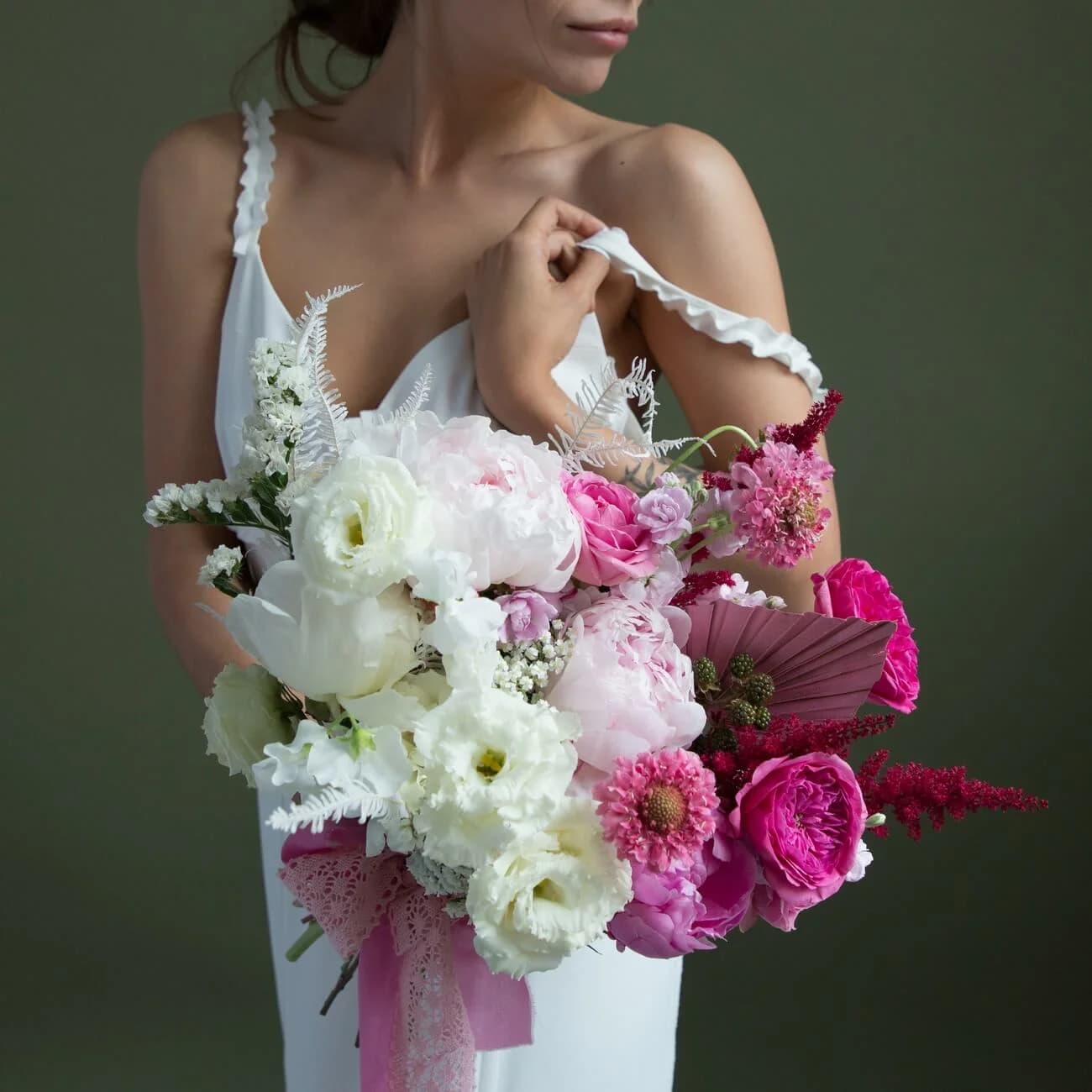
- Pastel rainbow — pink + blue + yellow + green in one bouquet. Reads scattered and dated (early 2010s aesthetic).
- Neon accents — bright pink or neon coral in an otherwise-neutral palette. Ages poorly in photographs.
- Excessive white with baby's breath — the 2000s wedding default.
- Purple and pink — clashes in most photography, competes rather than harmonises.
Palette selection principles
Match the venue lighting. Warm ambient lighting (candles, tungsten) brings out warm palettes (blush, coral, burgundy). Cool lighting (LED, fluorescent) works with cool palettes (dusty blue, sage, white).
Sample palette physically. Bring fabric swatches, ribbon, printed invitations to the florist consultation. Screen colours don't match flower colours.
Consider what your bridesmaid attire is already doing. If bridesmaid dresses are sage green, your flower palette needs to work with sage — either cream and blush against sage (harmonious) or coral against sage (complementary). Not another green (competing).
Test in daylight. If possible, photograph a sample bouquet in the venue's actual lighting a few weeks before the wedding. Colour rendering under different lights varies dramatically.
Pick your non-negotiable flower first. If you want peonies (May-June Northern Hemisphere), that narrows the palette to peony-compatible tones. If you want dahlias (September-October), same. Season and flower choice constrain the palette; work with that constraint.
Wedding party alignment
The bridal bouquet leads. Bridesmaid bouquets simplify from it (60-70% size, same palette but fewer varieties). Boutonnieres share at least one focal flower with the bridal bouquet. Family bouquets echo palette in a smaller scale.
Discuss with the florist ahead of time whether all bridesmaid bouquets are identical (traditional) or slight variations on the theme (modern trend).
Palette timing considerations
Peak wedding-flower months (May, June, September, October in Northern Hemisphere) unlock most palette options. Peonies for blush and cream, dahlias for coral and moody.
Off-peak months (January, February, November for Northern Hemisphere) narrow choices to year-round supply (roses, ranunculus, lisianthus, hydrangea). Palette should be built around these staples, not around out-of-season specialty flowers.
Southern Hemisphere — inverted. Peonies October-January, dahlias January-April.
For the seasonal calendar, see:
Frequently asked questions
Can we combine two palettes?
Yes, especially across ceremony vs reception. Neutral cream palette for ceremony and burgundy palette for reception is a common bifurcation. Discuss with your florist.
Which palette photographs best?
All six above photograph well in appropriate lighting. Truly-neutral palettes (cream and blush) are most-forgiving of imperfect lighting. Bright palettes (coral and mustard) require warm lighting or daylight to look their best.
How much does palette affect cost?
Marginally. Specialty flowers cost more per stem, but the total cost difference between palettes is usually within 10-15%. The much bigger cost variable is total flower count, not colour choice.
What if my venue is very colourful?
Ornate venues with strong existing palettes (heavy patterned wallpaper, coloured drapery, bold carpeting) require flower palettes that either match or intentionally contrast. Photograph the venue with the flower palette samples together before booking.
Related
- Wedding bouquets hub — the piece that anchors the palette
- Modern wedding bouquets — the modern aesthetic system
- Wedding centerpieces — the largest visual presence at reception
- Order in Dubai — our studio services